
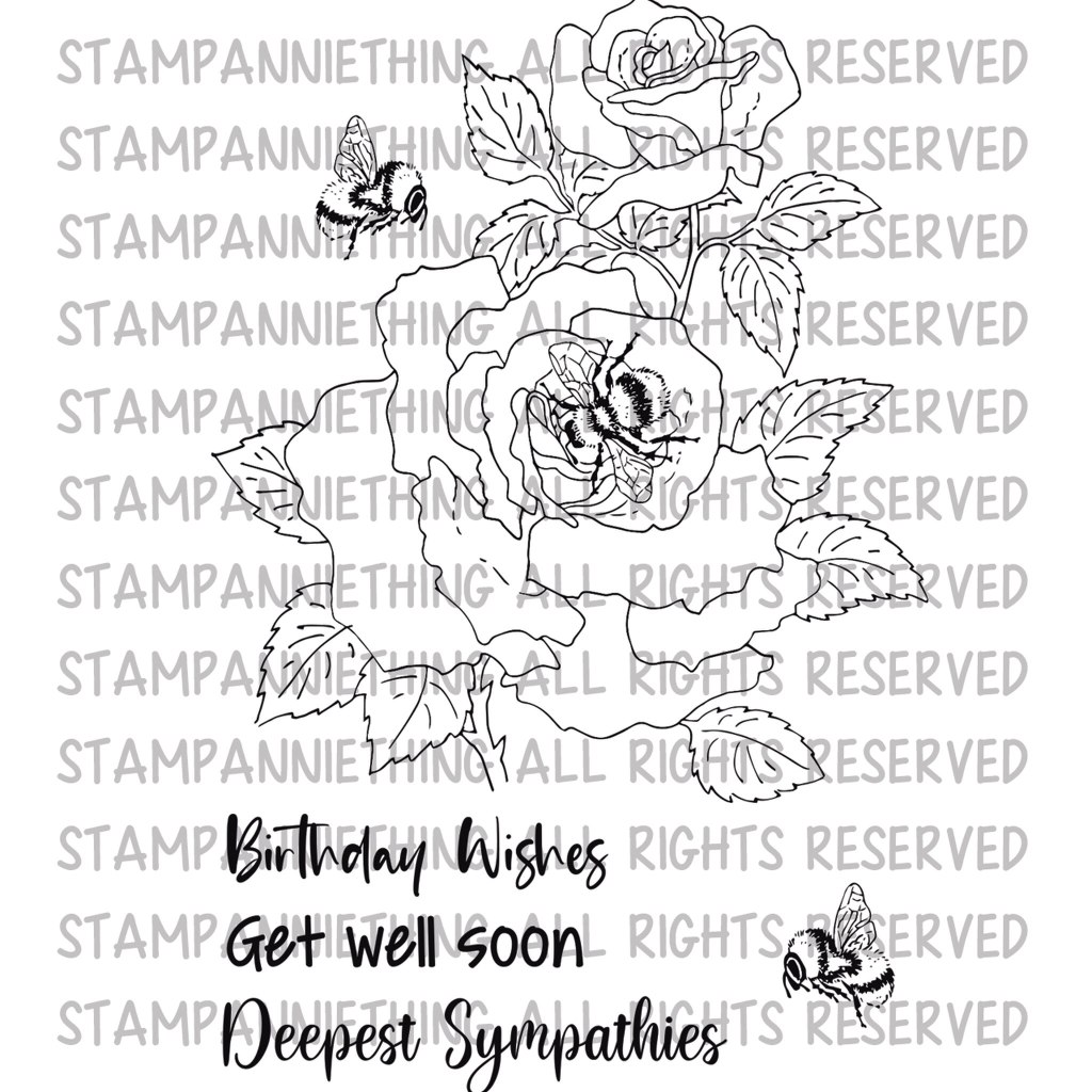
Hi Everyone! This is the support post for my Sets The Tone Session in the Stamp Anniething Stampers Facebook group today! I am going to be looking at some handy tips and ideas for colouring flowers, using the beautiful rose from the “Bumble Bee and Roses” Stamp Set, drawn by Ron Kropf for the Annie’s Garden Collection.
I will pop a link to the video here. After it has finished it is available in the facebook group to watch from the start and a few days later it appears in the Stamp Anniething YouTube Channel.
The colours I am using in todays livestream are 101 White, 140 Light Ultramarine, 120 Ultramarine, 151 Helioblue Reddish and 199 Black. (If you have 157 Dark indigo, you can use that instead of 151, or 199!)
Here is a list of some of the ideas and tips I shall be covering today.
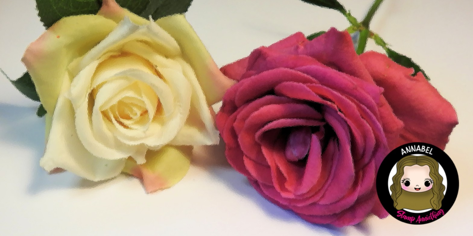
Using a photo for inspiration – Whatever flower you are colouring it is always possible to find a real flower that you can use to inspire your colours and shapes. If you were drawing the flower I would recommend taking your own reference photos to use, but as we are using a stamp, and only require it for colour, light and shadow reference, it is fine to track down some images of real flowers via google, or in gardening books etc. Using realistic inspo can help bring your colouring to life.

Using a physical object – if you can work from real life and a 3D object, getting a real rose, or a fake rose will help. If you want to add realistic light and shadow to your drawing it’s ideal to view a 3D object to help work it out. You can take a photo of your physical object, that’s fine too!
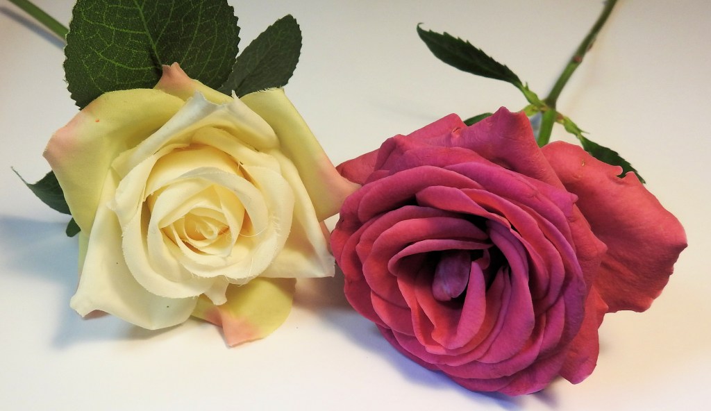
Using your photo for a colour palette – You have probably seen lots of colour inspo shots online, why not make your own to help you colour. It can be surprising what colours are hidden in a flower. If you have the technology, lift colours from your photo to make a palette to inspire your colouring.

Using others art for inspo – It’s fine to use someone else’s card or art to inspire your own, but you have to credit them. Also being “inspired by” is fine, “copying” less so. If you want to colour your flower and use someone else’s colouring to inspire you, make sure you mention it if you post your work publicly. That’s nice etiquette!
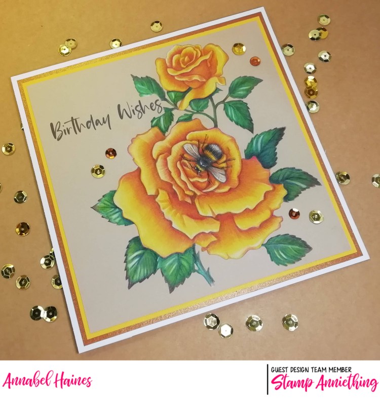
White/Light/Shade – One petal at a time, plan out any white areas, medium shade areas, and dark shade areas. To begin, use the lightest colour you think you will be using in each part and add the darker tones after.
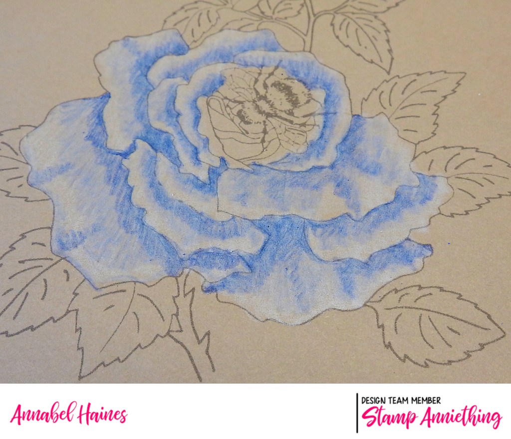
Colour the same direction as the petal points – Although you may want to blend using a circular motions, or make initial layers scribbly, generally the natural lines in petals follow the direction the petal points. So lines go from base to tip, not side to side. Make your uppermost layer’s strokes as natural as possible.
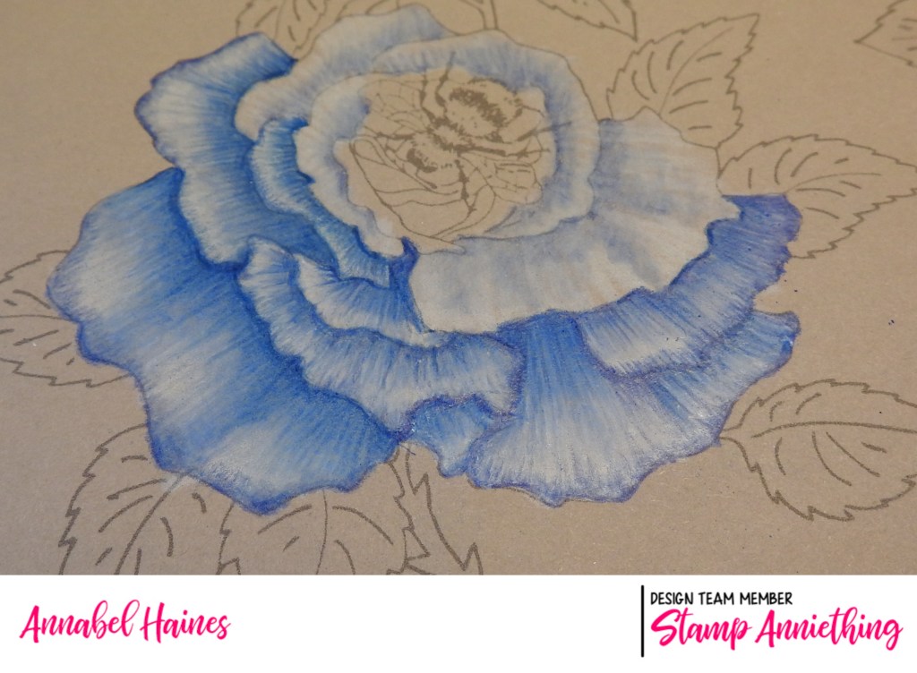
Final Touches – right at the end, risk going in with a darker shade than you have used so far and in the deepest shadow areas, add a stronger dark shade, gently. If one petal shades another, or the whole flower shade a stem, these can be good areas to add a darker shadow. Similarly, maybe add some white gel pen, or posca pen to the brightest whitest highlights.

Thank you for joining me today, in real time, in blog time, or in playback time! Hope it was interesting to watch and learn about my process!
((Late edit – I decided not to waste my flowers from the Live and made them into a sympathy card as intended. I kept with a no-bee option too!))